Animated Button Projects Gallery 2025

Premium animated buttons · GSAP · Holographic · Cinematic · Live previews · Free download

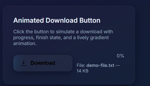
The Coodeverse Animated Button Projects Gallery 2025 is a free collection of 20+ premium HTML CSS JS interactive button designs including an Animated Download Button, GSAP Holographic Button, Cinematic Truck Button, Pulsing Button, Epic Delete Button, Animated YouTube Subscribe Button, Sign In, Sign Up, Search, Upload, Refresh, View More, Learn More, Logout, Next, Submit, Join Now, Simple Cancel, and Stunning Cancel buttons. All projects include live previews, full source code, and are completely free to download. No sign-up required.
Frequently Asked Questions

Coodeverse offers 20+ free animated button projects: Download, Join Now, Learn More, Logout, Next, Refresh, Search, Sign In, Sign Up, Submit, Upload, View More, YouTube Subscribe, Epic Delete, Next Gen Holographic (GSAP), Pulsing, Simple Cancel, Stunning Cancel, Ultimate GSAP Button, and Cinematic Truck Button. All include full HTML CSS JS source code, live previews, and are free without registration.
To create an animated CSS button: (1) Set base styles: padding: 14px 32px; border-radius: 8px; background: linear-gradient(135deg, #6366f1, #8b5cf6); border: none; color: #fff; font-weight: 700; transition: all 0.3s ease. (2) Add hover: button:hover { transform: translateY(-3px) scale(1.04); box-shadow: 0 8px 24px rgba(99,102,241,0.5); }. (3) For shimmer, add ::after with gradient sweep @keyframes. (4) For ripple, use ::before circle that scales on click. The Coodeverse gallery has 20+ free working examples.
To make a GSAP holographic button: (1) Add a rainbow hue-rotate CSS animation for the gradient shift. (2) Overlay a semi-transparent diagonal white stripe for the glass reflection. (3) Use GSAP to animate 3D tilt on mouse move: gsap.to(btn, { rotateX: mouseY, rotateY: mouseX, duration: 0.4 }). (4) Add particle shimmer elements following the cursor. The Coodeverse Next Gen Holographic Button is a complete free GSAP example you can download.
To create a pulsing ring button: (1) Set position: relative on the button. (2) Add ::before and ::after as rings: position: absolute; border-radius: 50%; border: 2px solid currentColor; inset: 0. (3) Animate with @keyframes pulse: from { transform: scale(1); opacity: 1; } to { transform: scale(2); opacity: 0; }. (4) Apply animation: pulse 1.5s ease-out infinite on ::before and add a 0.5s delay on ::after for the layered stagger. The Coodeverse Pulsing Button is a complete free example.
Yes! Every button project is 100% free — no registration, email, or payment needed. All are licensed under CC BY 4.0. Use, modify, and include them in personal or commercial projects. Simply credit Coodeverse.
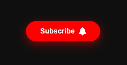
To create a YouTube subscribe button: (1) Red button with Subscribe text and bell icon. (2) On click, change to gray with Subscribed text and checkmark. (3) Animate with CSS transition: background 0.3s ease, transform 0.3s ease. (4) Add bell shake: @keyframes shake { 0%,100%{rotate:0} 25%{rotate:15deg} 75%{rotate:-15deg} }. (5) Add click ripple with a scaling ::before pseudo-element. The Coodeverse YouTube Subscribe Button is a complete free example.

Explore 20+ free animated button designs

Live previews · Full source code · GSAP included · No sign-up · CC BY 4.0

Trusted by 50,000+ developers worldwide  ·  Coodeverse  ·  Free Forever